Developing and testing new creatives is key to what we do at Miri. Improving user acquisition campaign performance and hitting our clients’ objectives revolves around finding the best way to engage with users—that is, uncovering the best performing creative possible.
We discussed how to know which format, text size or animation type to use in a previous post. These best practices are extremely helpful in working on new ads—but how useful or impactful is this if you don’t know what and how to advertise them? Through consistent testing of over 3,000 ads for more than 30 apps, we’ve established a general segmentation for the ads we develop. Each ad we design can be broken down into one concept (the what) and one execution type (the how). In this more detailed article, we’ll explore this classification in greater depth and share our experience in how this breakdown performed in different app categories. This will hopefully give you some practical tips and tricks that will enrich your ad-creation process.
Throughout this post, we will be sharing example video ads that we have sourced from the Facebook Ads Library.
What’s a concept?
A concept is a specific hook or selling point that we want to advertise. Through our experience with creative testing, we started noticing similarities in the types of concepts that work across different app categories, leading us to create the segmentation below: Questions (opinion or challenge), Trailer/Tutorial/Onboarding, Progression and Statements.
- Questions are ads that engage with users by addressing them directly. We divide this category in two: the video can either pose a challenge or ask for an opinion.
- Trailer/Tutorial/Onboarding are creatives that precisely illustrate what the app is about and/or how to start using it.
- Progression ads focus on the evolution aspect of the app.
- Strong statements allow you to demonstrate the overall great benefits and strengths of the app.
What’s an execution type?
Execution is the way in which a specific concept is communicated. For each of the above concepts, the execution can vary hugely. We’ve summarised them into four principal categories: Native, Simple, Complex and Influencer.
- Native means making the ad look as much like organic content posted by a user as possible.
- Simple ads are more minimal, focusing on one key aspect of the app and may showcase a stripped-down version of it for clarity,
- Complex ads, on the other hand, reveal multiple selling points and emphasise the richness of the app.
- Influencers can deliver the concept being advertised. They are similar to testimonial ads or endorsements.
Based on our experience in working on hyper casual/ casual games, mid-core games, education, health & fitness and dating apps, we’ve developed (what we hope) is a useful table that demonstrates the specific concept and execution types that best fit each category. Feel free to use the template here, and as always, we more than welcome the opportunity to hear any findings you have and challenge our existing perceptions.
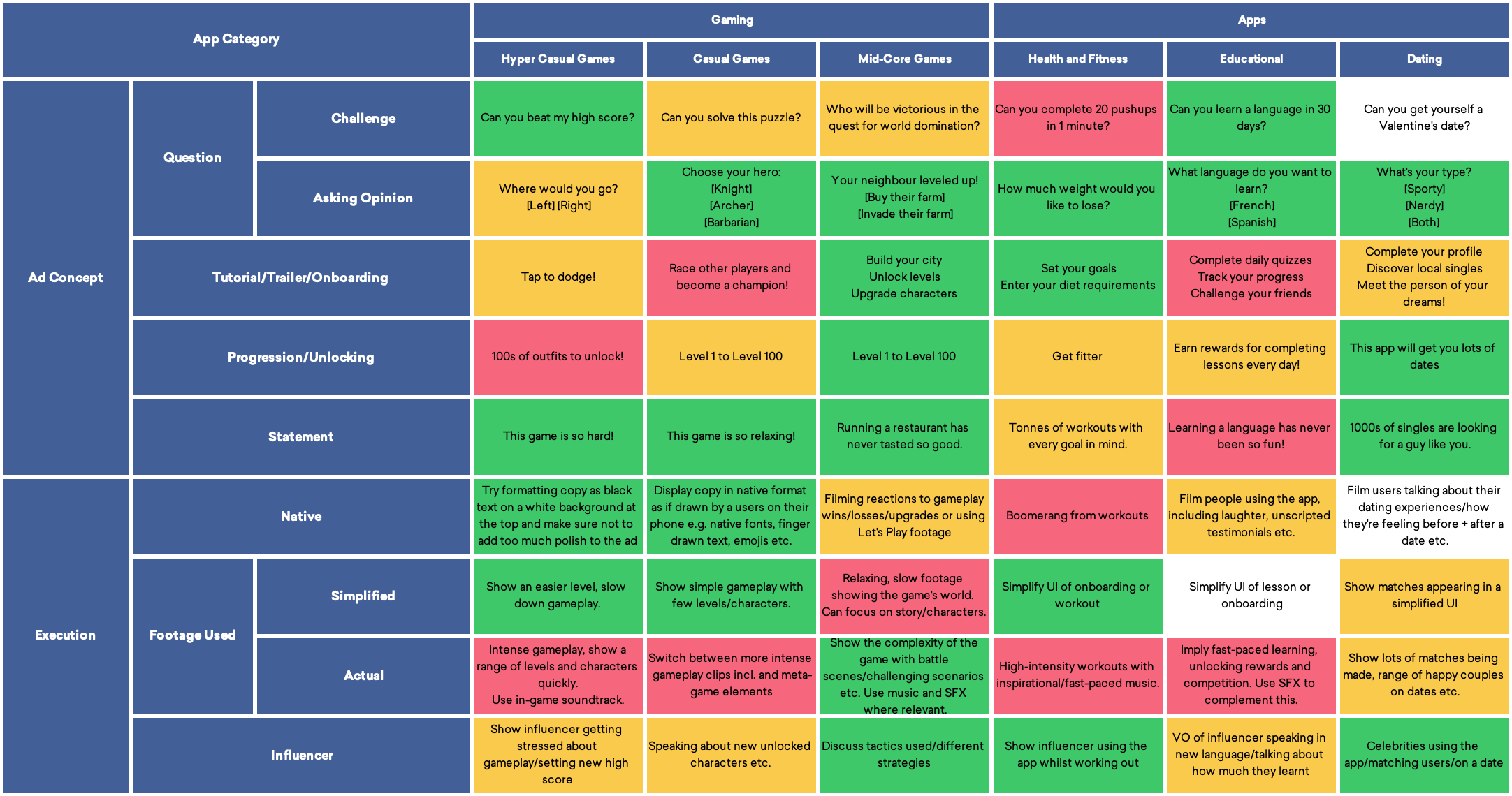
Part 1: Types of Concepts
Question: challenge the viewer
Posing a question as a challenge is a playful way to involve the viewer in the app/game by appealing to their sense of competition.
You can pit them:
- against the app/game: “Can you beat level 8?”
- against themselves: “Can you learn a language in 30 days?” or “Can you solve this puzzle?”
- against other users: “Can you beat your friends?”
The idea is that viewers will be incentivised to complete the challenge because they want to see if it’s possible, or because they think it’s easy and want to prove their skillfulness. Here, there are two options: ask an easy question that will flatter the user or ask one that is more complicated. We recommend to test both although puzzles that seem difficult but are, in reality, easy usually perform well. A challenge will also reveal the core goal of the app/game without having to reiterate it; for instance: “Can you solve this puzzle?” is probably a casual game.
The technique is also a great way to incite social reactions on platforms such as Facebook or Instagram. Friends can tag each other on the post, share it and add comments, which has the benefit of making the ad appear more like organic content rather than an explicit advert.
We’ve seen great success in the hyper casual games category with this method, as well as in health & fitness apps. When we asked: “Can you complete 20 push ups in 1 minute?”, viewers responded by tagging their friends and adding their own reactions. For casual titles, it is sometimes difficult to translate a puzzle grid into a challenging question (“What’s the next best move?” doesn’t really work for a match 3 game). A lot of mid-core games are harder to explain with a challenging question so we’ve also seen less success there.
Where we’ve seen this work: education, health & fitness, hyper-casual games
Question: ask for an opinion
Asking for the user’s opinion is a direct and effective way to not only form a relationship between them and the ad, but also communicate the central key concept of the app/game in as succinct a manner as possible.
First, questions invite the viewer to be part of the app’s experience before they even hit the install button. If the question is relatable, they will feel more drawn to the product. For a health & fitness app, something like “What are your fitness goals?” bridges the gap between a real goal the viewer wants to set and the services provided. The implicit message here is that this app/game is designed for the user’s enjoyment; we are interested in your opinion, what you do, and how you would do it.
Additionally, questions explain the app indirectly. For instance “Which horse will you pick?” clearly signals that it’s an equestrian game where the user can pick and upgrade their characters. Or, with “Which language will you learn: French or Chinese?” the user gets an idea of the features in the app, without needing to see any more. Through the use of specific concept-centred words, these questions convey all the relevant information whilst still being easy to read and engaging.
This concept worked across the board, in our experience. People seem to have opinions and enjoy sharing them (we are advertising on social media after all). It’s one of the first concepts we usually try. The exception would be hyper casual where challenging questions or statements perform better.
Where we’ve seen this work: education, health & fitness, casual games
How does the app work: Trailers, Tutorials and Onboarding Ads
While the question type of ad requires the user to actively participate, the next concepts call for more passive involvement. This one allows viewers to gain a greater understanding of what the product offers and how it works. Whether it’s through the demonstration of gameplay mechanics (tutorial), showing the app’s onboarding or account setup process (onboarding), or demonstrating a broad overview of its various selling points (trailer), these creatives aim to educate potential installers as best as possible on what the app is all about.
When creating longer, 25+ seconds trailer-style ads, we often like to split them into three sections so as not to overload the viewer. Have a think about how your app could be broken down into three components—these could be three key features or aspects of gameplay. In our experience, we find it makes sense for these to lead on from one another. For example, a trailer ad for a card-based strategy game could be sectioned into core gameplay, upgrading/unlocking characters and progression through levels. A health & fitness app trailer could be divided into segments showing goal setting, lesson footage and progress tracking.
In gaming, tutorial videos rarely seek to explain every aspect of the gameplay. Instead, we aim to show just one or two moves or strategies alongside some simple copy: “Tap to jump” or “Build your empire!” are examples that could work well here. For other app genres, tutorial ads can be a great way to illustrate how easy they are to set up and use. An ad for a photo editing app that demonstrates every single feature could overwhelm (or bore) a viewer, and distract from the app’s key selling points. Instead, try focusing on what matters most. ‘Onboarding’ ads are similar in appearance to trailers, but with the primary motive of testifying how easy it is to get started with the app or game which is a useful tactic when advertising more feature-heavy products.
Two categories where we’ve had success with this concept are mid-core games and health & fitness. In mid-core games, players often enjoy the app not only for the gameplay but also for the metagame which the ad can showcase. In health & fitness, showing how easy it is to get started is often a good way to interest the user. Overall, these type of ads seem to be a good fit for apps that are more complex and more difficult to explain.
Where we’ve seen it work: mid-core gaming, health & fitness
Incentivise the viewer: Progression and Unlocking
Every game will make use of progression in its own way, and this can be just as exciting for a user as the gameplay mechanic itself—so show it off in your ad! Whether it’s unlocking a weapon or power-up in a shooter or introducing a new storyline in an adventure game, these elements are what keeps users hooked by evolving their experience as they use your app.
Progression is also a concept that can be used in fitness and educational ads, especially considering that users of these genres will be more attracted to the app if they feel that they’re improving in ability. This could be demonstrated by showing ‘before vs after’ cartoons, or, for a language learning app, compare a user speaking Spanish at the beginning versus the end of the course. In dating, a key selling point is the quantity of (single) people using the app, implying that one can get meet more people there.
Testing creatives that call out the game’s ‘unlocking’ dynamic has delivered great results mostly for mid-core games. What we’ve discovered is that the ability to collect new items or characters is a huge draw for potential users, and there are multiple ways we can illustrate these features in a creative. An obvious example would involve showing multiple characters appearing in the frame, or popping up one by one or a character upgrading. Again, when the game is not only about simple gameplay, showing various aspects of the app works well. Whilst ‘unlocking’ mechanics are less commonly found in other genres such as educational apps, creatives can portray how rewarded the user is after completing challenges or tests, or meeting new people
Where we’ve seen this work: mid-core games, (idle games, not discussed in this article), dating
Statements make an impact
Statements can make a huge impact on an ad’s performance. It is a versatile tool that is rich in possibilities, allowing you to communicate everything from specific app features to the emotional aspects of the user experience. This concept tells people how great/difficult/relaxing/fulfilling the app you’re promoting is.
Sometimes we’ll call out a key mechanic, for instance: “The most explosive PvP shooter!”, or try to describe the feel of the app, such as: “Finally a fitness app that lets you set your own pace”. The choice of words used makes a tremendous difference to how the creative is portrayed and perceived by the viewer. Simply replacing one word in the copy—for example, from “This game is so hard!” to “This game is so relaxing!”—can suddenly transform the target user group it’s directed at. In our experience, shorter, snappier statements deliver the best results, although this can vary depending on the app’s genre and the visuals used.
This concept is more basic than the previous ones but it doesn’t mean it is necessarily less effective. Sometimes, the simplest ideas can be the best: show the product, say what it does and that it does it well. In many of these ads, the statement is accompanied by a specific example of what the app does, for instance gameplay or exercises. In other words, it may be the statement, the illustration or both that generate a good performance. We have seen the most success with statement ads in hyper-casual and casual games. We believe that the success of these ads is based on the right combination of content and messaging.
Where we’ve seen this work: hyper-casual, casual games
Concepts; summarised
The concept categories outlined above are, from our client work experience, key creative strategies that will deliver results across a range of different app genres. Connecting all four different approaches is their shared central objective: to catch the user’s attention.
On one end of the scale, questions and challenges promote active engagement by motivating the individual on a personal level. Trailers and tutorials represent the passive side of the scale, focusing more on creating an emotional connection with the viewer by suggesting that the product fulfils a pre-existing need. Progression ads, on the other hand, drive and create new needs by presenting gradual evolution and unlocking of features as tantalising incentives. Perhaps the most versatile and straight-forward of all the concept types, statements make an immediate impact, but without divulging too much detail.
Part 2: Types of Execution
There are multiple ways to execute an ad concept and we wanted to detail four overarching categories that we can fit most of our creatives into. We usually have these distinctions in mind when briefing ads so that we can align our vision with our designer and optimise performance: simple, complex, native and influencer.
Simple vs Complex, and when to use them
The first two categories with which we separate execution types are two extremes of the same axis: simple/calm vs complex/busy.
A simple execution can mean a few different things:
- Strip down the UI of the app in order to focus on a specific feature.
- Reduce the amount of sound effects or music to make the ad feel less chaotic.
- When showing gameplay, present a simpler level so as to ensure you explain the game rather than confuse the user—the rationale being that we want them to take away the core idea of the app
We tested both simple and complex execution types for a health & fitness app, using the ‘Onboarding’ ad concept described above. One demonstrated the UI of the app, whilst the other was much more stripped down, omitting elements of the UI that weren’t necessary for an ad. The latter performed much better. We believe it was because it focused on what mattered—namely, what goals are offered and what type of dietary suggestions users are interested in.
Remember: it’s not necessary to show all steps on a registration screen! We’ve seen similar methods achieve efficient ad performance improvement within the casual and hyper-casual games categories. Specifically, slowing down the gameplay, getting rid of unnecessary characters or elements in the background and using simple sound effects as opposed to richer types of music.
Where we’ve seen simple execution work: health & fitness, hyper-casual, casual games
On the other side of the axis, complex execution includes ads that show the actual UI of the app, illustrating several or all of its features. Ideal for apps which require more in-depth explanations, you can also show the overall richness, complexity and intensity of the environment to generate user excitement and anticipation.
For instance, when we work with mid-core titles, we see that performance is improved when several selling points are being communicated at the same time. In this case, we really show off the gameplay; how you can challenge other players, the multiple levels, characters or options that can be unlocked etc. When some health and fitness apps focused on the intensity of the workouts on offer, we saw elevated performance. Sure, a richer ad can also mean a longer ad, but that doesn’t mean it can’t perform well. In fact, we’ve encountered both long and short creatives that focus on the wealth of features achieve great results.
This execution type may lead to longer ads which are a better fit for rewarded videos. This means that the boosting performance may be related to the placement, rather than the actual concept. Either way, we have seen this type of ad perform better for more complex games where a simpler execution may not convey the richness and depth of the app.
Where we’ve seen complex execution work: mid-core games
Whilst complex ads have their own benefits, based on our accumulated learnings simple execution is the way to go (although we have seen exceptions which challenge this).
Be more native
Native advertising. It’s a term that’s loosely thrown around and can mean many different things in practice. At Miri, we simplify it to two strategies: filming specific content (such as someone using an app), or adding overlays to existing footage to make a video ad look like it was made by a regular (i.e. native) user on the given platform.
The idea behind executing a native ad is to make it feel more natural and less intrusive to the viewer. This could mean that the user may gloss over it and it doesn’t stand out, or it may mean that they don’t immediately skip it because it doesn’t look like an ad. As always, the only way to find out if it works for your audience is to test it.
We tend to divide what constitutes as native between Facebook, Instagram, Audience Network, and Snapchat because, naturally, the content digested on each platform is different. However, we’ve found some similar tactics that we employ across all of them:
- Remove the polish: the average social-media user will not be a motion graphic designer, so the content they share will not have finessed transitions or perfect typography. Small details such as scribbling on backgrounds as if done with a finger, using arrows as if you’re annotating your own video, and using a preset font can transform a video
- React with Emojis & GIFs: they’re everywhere. Emojis and GIFs are relatable, and we’ve found that finding the right visual queues to match your concept can impact performance
- First-person copy: designing the copy as if written by an individual, based on their experiences, or speaking to an individual is a good way to make an ad appear native. Try using colloquial terms, being more friendly, or challenging the viewer specifically
We’ve found that adding native overlays has worked well for casual and hyper-casual games. For example, filling the video with gameplay and overlaying with copy at an angle, paired with an emoji. In other cases, using simple black font on a white background (or vice-versa) has delivered better results.
Where we’ve seen this work: hyper-casual, casual games
Use an Influencer (or become one yourself)
Using influencer content can also be an effective way of communicating the selling points of an app—people who know the individual may be more inclined to watch the video and trust its validity. Watch out though, as this comes with the downfall of either targeting too niche an audience, or becoming very expensive because you’re hiring very well-known influencers. If you have access to influencer content, it’s worth testing what’s available. If not, a cheap alternative to see if it could be the right fit for your app is to film the footage yourself on your phone.
Test footage with your front-facing camera; for instance, a simple video of somebody talking on the phone about their experience with the app can be quick and easy to put together. We’ve found that using influencer content has worked particularly well for Health and Fitness apps, perhaps because having an advocate that can attest to the many positive claims of the ad gives them legitimacy and authority. We’ve also seen that mid-core games can benefit from gameplay and influencer paired footage that show the gamer reacting to the game they’re playing. What is unclear is whether the success of these ads can be wholly attributed to the recognisability of the influencer, or if the user-directed and personal nature of the video plays its own part.
Our greatest learning about influencer is that videos are a much more complex format compared to animations, with a huge number of variables that are difficult to A/B test independently. As such, performance can vary significantly between two videos that can look very similar on the surface. We recommend exploring as much as you can at the beginning, instead of focusing on the details. Only once you’ve found a concept that works should you attempt to try iterating and learning.
Influencers can be a great way to reach your audience. We’ve seen them work well in mid-core games where the endorsement of a game by credible people has a positive impact on performance. In other categories, influencers promote health & fitness as well as dating successfully. In both cases, it seems that the influencer has to be relevant to the product they advertise.
Where we’ve seen it work: mid-core games, health & fitness, dating
Execution; summarised
As with types of concepts, through our continuous process of trial and error we’ve discovered multiple variations of execution approaches. Whether that’s making ads look as organic as possible, or tempering their degree of simplicity or complexity, considering these different segmentations is hugely useful for us when it comes to briefing a creative. Having said this, we’ll freely admit that there are just too many variables within what makes an ad successful, from the specific image or footage used to the unique vision of a particular designer, that isolating any single determinate is near impossible. That’s why we live by the motto: test, iterate and test again! It’s only by experimenting that you’ll be able to discover the most interesting results.
Our concluding thoughts
In these past few years, testing and analysing dozens of ads every week has taught us how to identify the optimal concept and execution approaches for specific products—the crux of which are summarised in the table detailed in this post. Our broad observations seem to point to the conclusion that for simpler, easier to understand apps, a direct and simple message, perhaps in the form of a statement or question, works well. If the product is slightly more difficult to explain, telling the user in more detail what the app is about may be the better way to go, with a more complex trailer for example.
Whilst we’ve established a compendium of techniques that produce results, it’s crucial to note that what works for us doesn’t necessarily work for everyone. That’s why we wanted to open this topic up for discussion; have we inspired you to use our segmentations? What would you do differently from us?
Let us know, tweet us @mirigrowth.